This project is a perfect example of an artist sign. The logo was designed by local artist Robert Tatum. This sign was to be a dimensionally shaped sign with exposed neon in a historic district in San Antonio. This was to be a sign that would really honor the style and feel of the 1950’s. I was approached with the project and eagerly agreed to manufacture the sign, as I love this period in Americana and art in general. “I feel the sign industry has really gotten unimaginative and relies on cheap and easy to build square signs with back lit plastic “
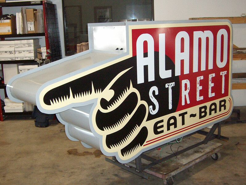
 The first step was to manufacture the sign cabinet. The two sign faces were cut to shape then welded to an aluminum frame. We then painted the “sign can” and applied state of the art, high performance vinyl logos on each side. We attempted to find an old sign painter, but that is a long dead art form. The last sign painter in the wild was spotted in the early 80’s, around the time computer controlled vinyl cutters were introduced!
Step two was the neon itself. I produced paper patterns of all of the text and hand outlines. “ Exposed text is the living heart of the neon world. This particular sign, due to height restrictions of the historic district, is only 15 feet to the top of the sign. Accuracy and attention to detail was essential on this job”
The next step was to mount the prepared neon units to the sign. This is a time consuming process of marking, drilling and then attaching the units to their tube supports. Inside the can is where all the transformers and switches are mounted.
When all was done, the completed sign was transported to the jobsite and installed on an existing sign pole. ” The final installation was completed without any complications. I use only the finest contractors and vendors. My good friends at SignTek in San Antonio were instrumental in putting the finishing touches on a detail intensive project.”


